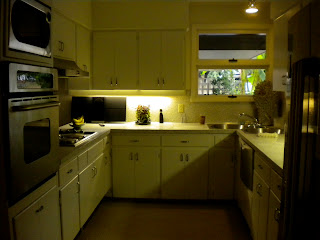
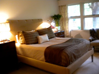
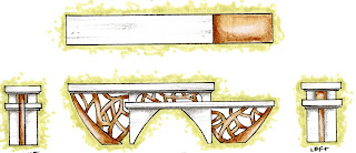
The final drawings for the bungalow project. These are going to serve as the unifying elements to connect my dual board design and show that I am trying to make a clear connection between the bungalow and the bonsai.
a scribble in space
Thursday, October 28, 2010
Wednesday, October 20, 2010
Painting Inspirations
Our next trip was to the art museum next to studio. There we were each assigned a painting to use as our Ranch precedent. My painting was done by Maud Gatewood when she was still a college student here at UNCG. "Maud painted what she saw and she was a very keen observer," said her longtime friend Dot Hodges, who was also a co-owner of a Charlotte gallery. Her paintings were always daring like "nothing escaped her curiosity. She loved capturing the moment and she lived for these moments in her artwork. Her life was simply about her artwork, nothing else mattered. "She did believe there's order in nature," Hodges said. "She would look at things and find the natural patterns." Gatewood graduated from Woman's College (now UNC Greensboro) with a degree in fine arts in 1954. From then on she went to several Universities to teach and continued to flourish in her artwork as one o the most well known North Carolina painters. Her friends would always say, "She lived to paint; she didn't live to promote herself. She felt she was a decent painter, but she just didn't seek out notoriety."
This painting, because it was one of her earlier works, seems to fit her title as an artist at the time. Her Art instructor was said to be cruel and did not let the women venture off into their own art style very much. When looking at this painting, I can see the struggles between what she wants to paint, and the world that is confining her. It is tough to say how I might apply this to my “Ranch” project. I feel that it would be interesting to play with contrasting elements to give the room a slight sense of confusion without creating chaos. I want the viewer to feel succumbed by my space, like each space fits into the other to make him feel a sense of “lost” and “wander” I have to play with how I will turn this feeling into something positive. I want to focus on the feelings that the paintings gave me and the fact that it is so different from any other paintings Maud did in her professional career. It seems as though I might be playing with a play on boundaries with this project because this is the first painting in which she pushed outside of her boundaries as much as she could.
Ranch Exploration
Our New project is the study of a Mid-century Ranch stye home. These are some images of the precedent space that we will be working with. Through these images, I explored the space in small details.
EXTERIOR
LIVING/ DINING
PUBLIC/ PRIVATE
Wednesday, September 29, 2010
Coming Together
My designs have finally made it to my boards! This collection of drawings and creative layout further fuse my design with the project statement and strengthen my concept of bonsai. I still have to play with minor details but I'm almost there! I can see the finish line!
Sunday, September 26, 2010
Branching into Space
I finally took my designs another step further and everything came together through my elevations and sections. These images clearly depict all of the ideas that i had previously discussed and really make my thoughts come to life (or to paper) The drawing style is a mixture of pen, prisma color markers and prisma color pencils. Images have also been edited through photoshop. Photoshop was a key element the the placement of the wall paper and the reflections of the mirror art-piece in the bottom section.
Friday, September 24, 2010
Bird's Eye View
Through this floorpan, i tried to portray, materials as well as the furniture within the context of the space. I feel that the dialogue of the furniture pieces clearly reinforces my ides of bonsai and the elements from the exterior to center of the room. (leaves to trunk)
Wednesday, September 22, 2010
refining : revision
These are the finalized elevations of my custom furniture pieces. I drew them to scale and showed them t every angle to help the viewer better understand each piece and to make it easier for me to ply with their positioning in the space itself. Its like I made my own stencils for design! I feel that these sketches make the furniture look like a more cohesive design and portray my concept.
Subscribe to:
Comments (Atom)


